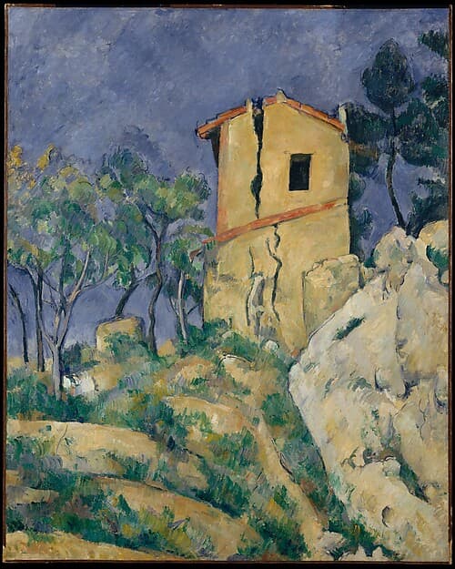
Bright and Vivid Colors
Saturated, high-intensity hues chosen to strike the eye, from medieval manuscripts and Mughal painting to Fauvism, Pop and light art.
No works indexed yet · 10 related artists
No open-access works for Bright and Vivid Colors are in the index yet. They will appear here as more collections are indexed.
About
Strong colour was once costly. Ultramarine ground from lapis lazuli could be dearer than gold in medieval Europe, so the brilliant blues of illuminated manuscripts and altarpieces also signalled devotion and wealth. Vivid pigments, dyes and glazes carried similar prestige in Mughal miniatures, Chinese enamelled porcelain and West African kente cloth.
Chemistry changed things in the 19th century, when synthetic pigments such as cobalt blue, chrome yellow and later cadmium yellow became cheap and, once sold in tubes, portable. Henri Matisse, André Derain and Maurice de Vlaminck used them almost unmixed in the Fauve paintings of 1905–06, freeing colour from description. Pop artists later borrowed the loud, flat hues of advertising, and hard-edge painters such as Carmen Herrera set saturated fields against one another. Dan Flavin and James Turrell made coloured light the material itself. Look for colour that pushes forward rather than sitting back.
Related artists
More in Visual Qualities
Bulbous
Calligraphic
Color Gradient
Columns and Totems
Contour Line